
A remark plugin for admonitions designed with Docusaurus v2 in mind.
remark-admonitions is now included out-of-the-box with @docusaurus/preset-classic!

Installation
remark-admonitions is available on NPM.
npm install remark-admonitions
If you're using unified/remark, just pass the plugin to use()
For example, this will compile input.md into output.html using remark, rehype, and remark-admonitions.
const unified = require('unified')
const markdown = require('remark-parse')
// require the plugin
const admonitions = require('remark-admonitions')
const remark2rehype = require('remark-rehype')
const doc = require('rehype-document')
const format = require('rehype-format')
const html = require('rehype-stringify')
const vfile = require('to-vfile')
const report = require('vfile-reporter')

const options = {}

unified()
  .use(markdown)
  // add it to unified
  .use(admonitions, options)
  .use(remark2rehype)
  .use(doc)
  .use(format)
  .use(html)
  .process(vfile.readSync('./input.md'), (error, result) => {
      console.error(report(error || result))
      if (result) {
        result.basename = "output.html"
        vfile.writeSync(result)
      }
  })
Docusaurus v2
@docusaurus/preset-classic includes remark-admonitions.
If you aren't using @docusaurus/preset-classic, remark-admonitions can still be used through passing a remark plugin to MDX.
Usage
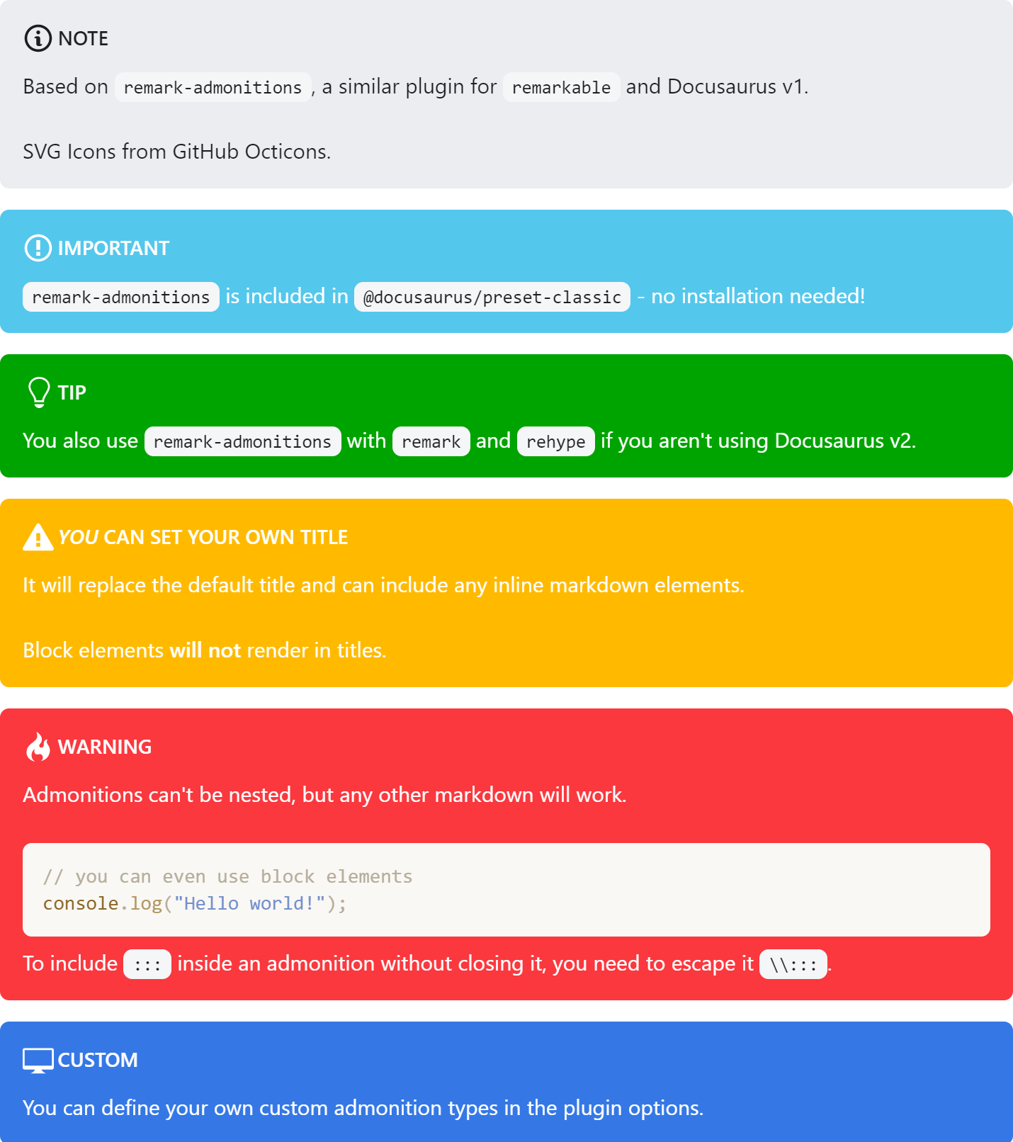
Admonitions are a block element. The titles can include inline markdown and the body can include any block markdown except another admonition.
The general syntax is
:::keyword optional title
some content
:::
For example,
:::tip pro tip
`remark-admonitions` is pretty great!
:::
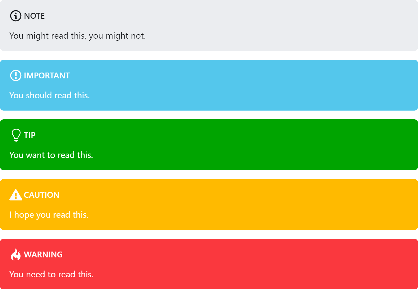
The default keywords are important, tip, note, warning, and danger. Aliases for info => important, success => tip, secondary => note and danger => warning have been added for Infima compatibility.
Options
The plugin can be configured through the options object.
Defaults
const options = {
  customTypes: customTypes, // additional types of admonitions
  tag: string, // the tag to be used for creating admonitions (default ":::")
  icons: "svg"|"emoji"|"none", // the type of icons to use (default "svg")
  infima: boolean, // wether the classes for infima alerts should be added to the markup
}
Custom Types
The customTypes option can be used to add additional types of admonitions. You can set the svg and emoji icons as well as the keyword. You only have to include the svg/emoji fields if you are using them. The ifmClass is only necessary if the infima setting is true and the admonition should use the look of an existing Infima alert class.
const customTypes = {
  [string: keyword]: {
    ifmClass: string,
    keyword: string,
    emoji: string,
    svg: string,
  } | string
}
For example, this will allow you to generate admonitions will the custom keyword.
customTypes: {
  custom: {
    emoji: '💻',
    svg: '<svg xmlns="http://www.w3.org/2000/svg" width="16" height="16" viewBox="0 0 16 16"><path fill-rule="evenodd" d="M15 2H1c-.55 0-1 .45-1 1v9c0 .55.45 1 1 1h5.34c-.25.61-.86 1.39-2.34 2h8c-1.48-.61-2.09-1.39-2.34-2H15c.55 0 1-.45 1-1V3c0-.55-.45-1-1-1zm0 9H1V3h14v8z"></path></svg>'
  }
}
To create an alias for an existing type, have the value be the keyword the alias should point to.
customTypes: {
  alias: "custom"
}
The generated markup will include the class admonition-{keyword} for styling.
If the infima option is true, the classes alert alert--{type} will be added to inherit the default Infima styling.
Styling
You'll have to add styles for the admonitions. With Docusaurus, these can be added to custom.css.
Infima (Docusaurus v2)
The Infima theme (styles/infima.css) is used by @docusaurus/preset-classic.

Classic (Docusaurus v1)
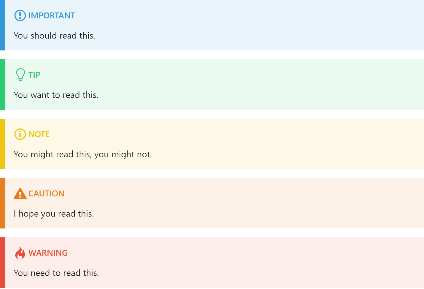
The classic theme (styles/classic.css) replicates the look of remarkable-admonitions and Docusaurus v1.

Credit
Syntax and classic theme based on remarkable-admonitions.
The SVG icons included are from GitHub Octicons.